
Terence C Mills
To understand the performance of a modern economy such as India’s requires an appreciation of some of its key features and most of these are of a quantitative nature. This article introduces some basic statistical ideas concerning the presentation and analysis of economic data that will enable a student to understand how these key features have evolved, and indeed continue to evolve. Due to lack of space, we will not discuss the acquisition of data, for much is freely available from electronic sources (indeed, all of the data used here have been downloaded from the Federal Reserve Bank of St. Louis FRED® economic databank). We thus concentrate on the behaviour of some core macroeconomic variables, these being output (GDP), consumption, the price level and inflation, and exchange rates. We show how using some very basic quantitative techniques can quickly provide a good understanding of the behaviour of some key features of the Indian economy.
Consider Figure 1, which plots quarterly data on nominal (current price) and real (constant price) GDP from 1996 to 2014. Both show increases over time, reflecting the long-term growth of the Indian economy, albeit interrupted briefly by the financial crash of 2007-08. Note, however, that the slope of nominal GDP is steeper than that for real GDP. This will always be the case when inflation is typically positive (see below), because the growth in nominal GDP can be thought of as being the growth of real GDP plus inflation (the growth of the price level). For this period, nominal GDP growth averaged 13.1 percent a year while real GDP growth averaged 6.9 percent, implying that inflation averaged 6.2 percent. This is a useful ‘decomposition’ to be aware of, for students are often confused by the real and nominal distinction, and knowing that the faster growing of the two will typically be the nominal variable should help to avoid mistakes.
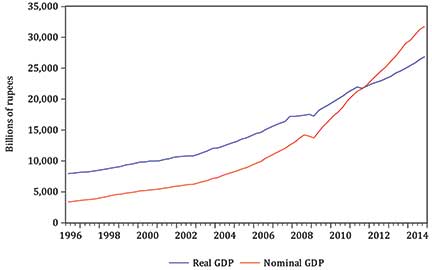
Figure 1: Real and nominal GDP for India: quarterly observations from 1996 to 2014.
A related confusion that many students have is that of misinterpreting the price level as inflation, which is the rate of change of the price level. Figure 2 plots monthly observations on the consumer price index for India over the period 1957 to 2015. The pronounced upward, relatively smooth and more steeply sloped evolution of the index is, of course, a consequence of the increasing level of prices in India over this period. This plot of the price level is very different from the plot of the annual rate of inflation shown as Figure 3. As can be seen, for only short periods in the late 1960s and mid-1970s is inflation negative, the latter period coming after a spell of rapid inflation which was a consequence of the oil price shocks of that era. Note that the two plots are very different and simply plotting the price level and inflation should end any confusion as to which set of data is which.

Figure 2: Price level: monthly observations from 1957 to 2015.
Figure 3 plots the annual rate of inflation, calculated as the percentage change in the price index over 12 months:

Although annual rates of inflation are the most natural to use, other rates of inflation may be calculated. For example, the monthly rate, shown in Figure 4 (see next page), is calculated as

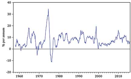
Figure 3: Annual inflation: monthly observations from 1958 to 2015.
In comparison with the plot of annual inflation, monthly inflation is seen to be of a smaller magnitude, since the percentage change in prices is being computed over just a single month rather than over 12, but relative to this magnitude, the variability of inflation is much higher. Thus the rate of inflation thought to be appropriate for a particular problem must be carefully defined and its properties clearly understood.
Real output may be thought of as deflated nominal output, in that it is obtained by dividing the latter by the relevant price level, known as the GDP deflator. Many macroeconomic aggregates appear in both nominal and deflated, i.e., real forms, such as consumption, investment and money, and as we have emphasized above, it is essential that both forms are correctly distinguished.
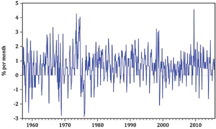
Figure 4: Monthly inflation: monthly observations from 1957 to 2015.
A more complex form of deflation is used when considering exchange rates. Figure 5 plots the monthly rupee/U.S. dollar (nominal) exchange rate from 1970 to 2015. This shows a long-run depreciation of the rupee, for a dollar was able to purchase just 8 rupees in 1970 but over 66 in 2015. Figure 6 shows, over the same period, the real effective exchange rate, or REER, of the rupee, and a very different picture emerges.
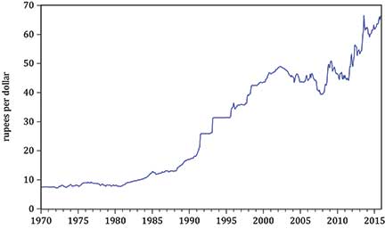
Figure 5: Rupee/U.S. dollar exchange rate: monthly observations from 1970 to 2015.
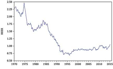
Figure 6: Real effective exchange rate: monthly observations from 1970 to 2015.
To obtain the REER, two calculations are made. First, real bilateral exchange rates (e.g., rupee/U.S dollar, rupee/U.K. pound sterling) are calculated for each of India’s major trading countries by adjusting each nominal exchange rate by the ratio of the respective price levels of the two countries. Second, a weighted average of these real exchange rates is formed using India’s trade (imports plus exports) with these countries as weights.
The REER is thus an index showing the value of India’s currency relative to other major countries, adjusted for the effects of relative inflation and weighted according to the extent of India’s trade with each of the countries. Figure 6 again shows depreciation until the mid-1990s but the REER has then stabilized, remaining relatively constant for the last two decades.
So far we have only considered economic variables in isolation, but much of economics is concerned with investigating relationships between variables and to be able to do this requires the unavoidable use of statistical techniques.
Figure 7 plots India’s quarterly (real) consumption and real GDP (now referred to as income) from 1996 to 2015. Both series have pronounced long-term upward movements, which are typically referred to as trends. Such trends reflect the overall growth of the Indian economy during this period and, of course, consumption is seen to be numerically smaller than income, for it is only one, albeit the most important, component of income (recall the national income accounting identity).
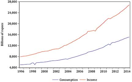
Figure 7: Consumption and income: quarterly observations from 1996 to 2015.
The consumption function is a key relationship in any model of the macro-economy, but attempting to assess any relationship between two trending series is fraught with statistical difficulties: for example, the two variables in Figure 7 do not possess constant means, as any average will increase as time passes due to the upward movement (trend) inherent in the data.
Consequently, it is good statistical practice to eliminate such trends (known as transforming the data to stationarity) and a simple way of doing this is to use growth rates, just as we did when transforming the price level to obtain inflation. Figure 8 thus plots the annual growth rates of consumption and income, computed using an analogous form of the inflation formula used above.
Although the movements of the two growth rates are not closely in concert, there is certainly a positive relationship between consumption and income growth, with a tendency for both to increase and fall together. This can perhaps be seen more clearly in the scatterplot of Figure 9, on which a line of best fit has been superimposed. This is the regression line which says that consumption growth is 2.64 percent a year in the absence of any income growth but increases by 0.53 percent for every one percentage point increase in income growth. The correlation between the two growth rates is calculated to be 0.46, confirming that there is a positive but not overly strong relationship between the two (the correlation can lie between –1 and +1, with positive values corresponding to an upward-sloping line of best fit). The slope of the regression, 0.53, may be interpreted as an estimate of the marginal propensity to consume.
consumption growth = 2.64% + 0.53×income growth
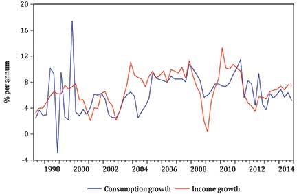
Figure 8: Annual consumption and income growth: quarterly observations from 1997 to 2015.
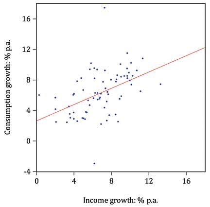
Figure 9: Scatterplot of consumption and income growth.
This short article has, I hope, demonstrated how some basic principles of data analysis and presentation can both illuminate key features of an economy and help to eliminate some of the more egregious errors that students are liable to make when moving from purely theoretical economic models to empirically modelling an actual economy such as India’s.
Note
Detailed discussion of key statistical concepts such as correlation and regression can be found in any introductory textbook on statistics for economists: see, for example, Terence C. Mills, Analysing Economic Data: a Concise Introduction (Palgrave Macmillan, 2014).
The author is Professor of Applied Statistics and Econometrics at the School of Business and Economics, Loughborough University, U.K. He can be reached at t.c.mills@lboro.ac.uk.